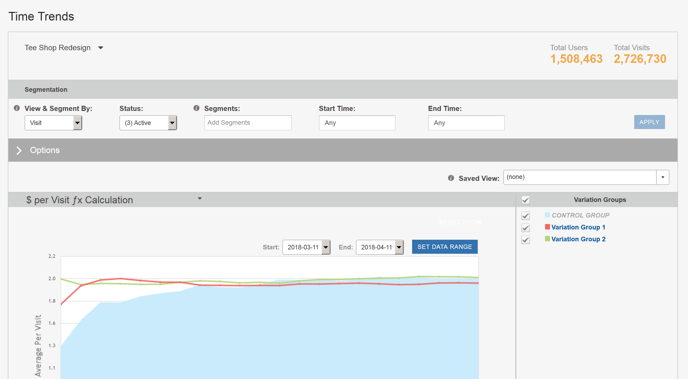
The Time Trends report helps you draw conclusions from your data based on the trends in the results. It plots the performance of the tested Variations over time for each Metric included in the Campaign.
Report Heading
The top of the report displays its settings and options. Settings are described in Report Settings. Options are described in Time Trends Report Options.
Report Body
The Time Trends report shows how user responses to individual Variations (including the Controls) change over time. The responses may vary widely over the duration of your Campaign. Sometimes the values spike and then settle into a period of stabilization during which the results trend more consistently over time. From this, you can derive a reasonable expectation of how Variations may continue to perform in the future. You may also be able to visually identify some effects of time bias such as significant changes due to a new promotion, a change in organic search engine ranking, and so on.
Stabilization and Extrapolation
The Stabilization Report Type (the default) shows the cumulative results for your Variations over time. Stabilization is the state at which accumulated data becomes consistent enough to derive predictions for their continued success or failure. This state is reflected in an area in which the graphs of responses no longer fluctuate widely but instead settle into a steady, predictable trend. Before stabilization, it is common to see each Variation's plot lines cross and overlap; after stabilization, each Variation's plot lines may fluctuate but generally will not cross one another.
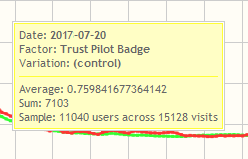
To help you analyze the Campaign results, an information window opens when you hover your mouse over a Variation's line graph. This gives you the same raw information about that Variation that you would find in the Performance Matrix report for Main Effects.
Comparing Variation Performance to Controls
To see how the Variations performed in comparison to the Controls:
-
Select Pairwise Diffs Variation vs. Control from the Plot Method drop-down menu in the Options panel.
-
Click Apply. This plots the average Variation responses using the x-axis as the Control Variation.

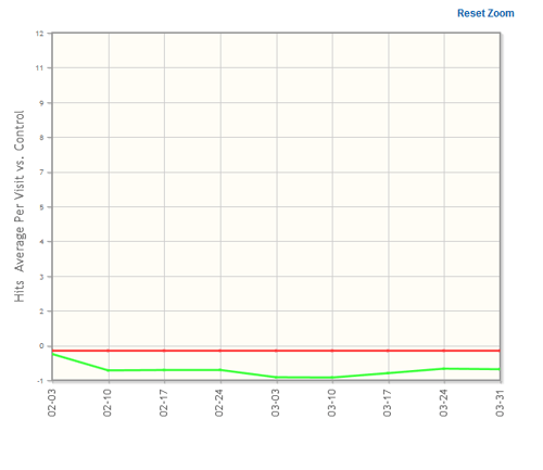
This view makes the graph slightly cleaner, since the Controls are plotted on the X-axis. It also shows, at a glance, which Variations performed better or worse than the Controls. Better performing Variations appear above the zero X-axis; worse performing Variations appear below the zero X-axis.
Viewing Specific Time Periods
It is useful to change the time periods plotted on the graph. There are two ways to do this.
-
Instead of viewing data for each day within the Campaign (24 hour period, as determined by your profile setting), you can view the data aggregated by weeks or months by selecting the time period from the Time Slice type drop-down menu. The following example shows the data by calendar week.
Viewed over a longer period, this shows a smoother graph, which may be easier to read.
-
On the other hand, you may want to view portions of the Campaign in greater detail. To view a portion of the graph in greater detail, click and drag to determine the section of the graph you want to see in detail. The graph redraws to display only that section.
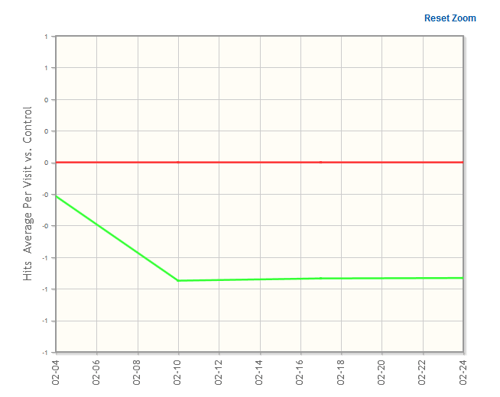
This allows you to view your Campaign in greater detail, making it easier to see which Variations seem likely to be most successful in the future.
Trajectory: The Trend of the Trend
If you do not gain enough confidence in the trends shown in the Stabilization view, you can view the data's Trajectory. The Trajectory view shows the incremental total average of each time slice's data. This demonstrates how rapidly a trend in the data is changing. Trajectory is to Stabilization as acceleration is to speed.
To view the Trajectory of your Campaign's data:
-
Select Trajectory in the Options section of the page under Report Type.
-
Click Apply. SiteSpect displays the Trajectory view.
The Trajectory view is helpful in determining how rapidly a Variation is garnering user responses. While the results shown in the Stabilization view might be too close to discern one from another, the Trajectory view shows which Variation is likely to best succeed in the future.
Choosing the Data to Plot
Within the Trajectory view, you can also plot different versions of the data. The default, Average Per Visit, shows the average number of conversions per visit. You can also choose to view the Sum Total of results.
Sum Total shows the total number of responses overall (not averaged by user or visit). Viewing the data this way provides a way to answer questions such as "How much revenue has each Variation generated over time?" It is important to note that the Sum Total does not account for sample size variance, so if you have adjusted the Assignment Frequency for any Variation Groups, this report could be misleading.
Studying Time Bias
The Time Trends Report also provides tools to help you assess time bias within your Campaign. There are two options available under Report Type that allow you to study your results by time category: Hour of Day and Day of Week.
The Hour of Day view shows the results averaged or totaled (depending on your Metrics to Plot selection) for each hour of the day over the entire Campaign.
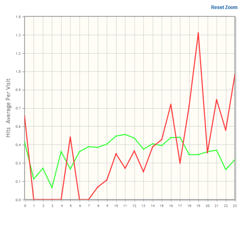
From this graph, you can see the predictable lulls and peaks in activity on your site. You may, for example, find that a disproportionate number of responses are recorded at specific times of the day.
Similarly, the Day of Week view shows the trend of responses averaged or totaled for each day of the week over the entire Campaign, illustrating biases on specific days of the week (Sunday through Saturday).
Alternative Methods of Presenting the Data
Smoothing
In the Report Options area of the page, listed under Options is a setting called Smoothing. When you select Smoothing, SiteSpect performs a Lowess (locally weighted scatterplot smoothing) regression analysis of the data. This smooths out the rough peaks and valleys in the results and gives a simplified view of the trends in the data. Compare the following graph to the original Stabilization graph.
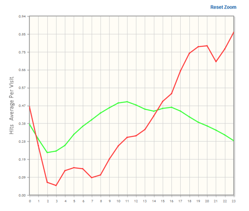
Note that with the Smoothing option, only the visual line is smoothed; the original unsmoothed data is shown in the pop-up window when you hover the mouse over a data point.